How to survive without image lists in a FireMonkey project

In the VCL, toolbar icons (glyphs) are set up using the TImageList component. In FireMonkey however, TImageList does not exist, and even TToolBar itself is half the component it is in the VCL – rather than manage its own buttons, it’s just a simple container control like TPanel. To add buttons to a FMX TToolBar, you therefore drop TSpeedButtons onto it; and to add glyphs to the buttons, you add a TImage control to each one. On the face of it this leads to a simpler situation that had with the VCL; on the other though, it causes maintenance hassles in non-trivial applications if the same glyph is supposed to be used by different buttons, or if you come to want to change the icon set to a different one, given each image must be changed separately.

Being bothered about this issue, I’ve found relief is at hand from the FireMonkey styling system though. Let’s see it in action:

  • Create a new FireMonkey HD application.
  • Drop a TSpeedButton onto the form, and clear its Text property. Next, add a TPanel (sic.) to the button. Since TSpeedButton won’t let you do this directly, reparent the panel by dragging its node onto the button’s node in the Structure pane (top left).
  • Set the panel’s HitTest property to False, and its Align property to alClient. If you want to be able to drag the button around at designtime, set either the panel’s Padding property to (2, 2, 2, 2) or the button’s Margins property to (2, 2, 2, 2). Note the meaning of Padding and Margins is (weirdly) flipped round compared to the VCL – this is something I still haven’t got used to myself!
  • Add a TLayout to the form, and set its Visible property to False.
  • Add a TImage to the layout, load a suitable ‘Open File’ glyph into its Bitmap property, and set its StyleName to ‘FileOpenGlyph’. For ease of identification in the designer, set its Name property to ‘FileOpenGlyph’ too.
  • Set the panel’s StyleLookup property to ‘FileNewGlyph’. Note you’ll have to type it, as the name won’t be in the drop-down list.

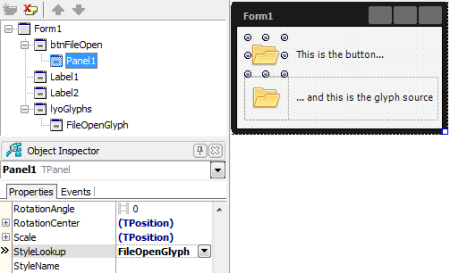
At the end of all that, you should have something like this:

GlyphStyleDemo

How this works is that TPanel, as a styled control (TStyledControl descendant), gets its visual appearance from another control, or more exactly, a copy of another control – the ‘style’. This other control can be anything – all that is crucial is that its StyleName property is set to a value matched by the value of the StyleLookup property of the intended style subject(s).

Normally, custom styles are set up via a TStyleBook component. Using a style book means using the IDE’s FireMonkey style designer though, which is something only a programming masochist can enjoy. What isn’t so obvious is that you don’t actually need to use TStyleBook in the first place however – any control that has its StyleName property assigned will be available as a custom style. So, doing just that is what we did in the demo.

Now, we placed the source TImage on a hidden TLayout given we didn’t want it to be shown at runtime – setting its own Visible property to False wasn’t an alternative, since that would have caused the control it styled to be invisible at runtime too! However, it may be the case that you would prefer not to clutter a form with the source glyphs at all. In a VCL scenario, this would mean putting the application’s image lists onto a data module, but given TImage instances are controls, we can’t do that here. Instead, we need to put the glyph images onto a dummy form, auto-created but not ever visible. In my own case I had a further requirement: the ability to switch at runtime to a different glyph set. This was necessary because I’m looking to support both dark and light UI styles, and currently working with monochrome icons. While that may change later, there was no harm in ensuring everything would work if it didn’t.

So, continuing with the demo, add another form to the project, name it ‘StdGlyphsForm’, and save its unit as App.Glyphs.Std.pas. Then, go back to the first form, cut the TImage to the clipboard, then paste it onto StdGlyphsForm. Because we do not want the new form to become the application’s ‘main’ form in the VCL/FMX sense, do not have it auto-created in the normal fashion (Project|Options, Forms). Instead, it needs to be created explicitly when the application starts up, and directly (i.e., using TGlyphsForm.Create not Application.CreateForm).

Before we get to that though, let’s set up an alternative icon set to test with. To do that, save everything, then duplicate App.Glyphs.Std.pas via File|Save As…; save it as App.Glyphs.Alt.pas, then rename the form to AltGlyphsForm. After that, change the contents of the image, then add the original version of the unit (App.Glyphs.Std.pas) back to the project as well. In principle, we can now choose which icon set to use at runtime by instantiating the appropriate form class (StdGlyphsForm or AltGlyphsForm); if we wanted to then switch sets at runtime, we can just free the first glyphs form, instantiate the second, and ask all ‘normal’ forms to update their styling.

When targting OS X pursuing such a plan works fine, but when targeting Windows there’s a problem: specifically, at one point in FMX.Platform.Win.pas, Screen.Forms[0] is used in lieu of Application.MainForm when the latter cannot be guaranteed to be initialised yet. Because of this, the first form that gets created – regardless of how – becomes the ‘owner window’ for subsequent forms at the Windows API level. If the first form created were to be one of our glyph container forms, bad things will then result.

One way to get around this is to ensure the real ‘main form’ creates the glyph container. However, this assumes you have a ‘main’ form in the first place, which when targeting OS X especially isn’t necessarily the case. After fiddling about the problem, my preferred solution at present is to create the glyph container, move its contents to something else that isn’t a form too (just a bare TComponent instance will do), then immediately free it. So, let’s do that with the demo, wrapping the necessary code in a simple singleton type.

For this, add a new unit to the project, and call it App.Glyphs.pas. Then, copy the following code into its interface section:

uses
  System.Classes;

type
  TGlyphsStyle = (gsStandard, gsAlternative);

  GlyphsManager = record
  strict private class var
    FGlyphsOwner: TComponent;
    FGlyphsStyle: TGlyphsStyle;
    class constructor Initialize;
    class destructor Finalize;
    class procedure SetGlyphsStyle(Value: TGlyphsStyle); static;
  public
    class property GlyphsStyle: TGlyphsStyle read FGlyphsStyle write SetGlyphsStyle;
  end;

Next, make its implementation section look like this:

uses
  FMX.Types, FMX.Forms, FMX.Styles, App.Glyphs.Std, App.Glyphs.Alt;

class constructor GlyphsManager.Initialize;
begin
  FGlyphsOwner := TComponent.Create(nil);
  FGlyphsStyle := gsAlternative;
  SetGlyphsStyle(gsStandard);
end;

class destructor GlyphsManager.Finalize;
begin
  FGlyphsOwner.Free;
end;

class procedure GlyphsManager.SetGlyphsStyle(Value: TGlyphsStyle);
var
  Comp: TComponent;
  I: Integer;
  SourceClass: TComponentClass;
  Source: TComponent;
begin
  if Value = FGlyphsStyle then Exit;
  case Value of
    gsStandard: SourceClass := TStdGlyphsForm;
    gsAlternative: SourceClass := TAltGlyphsForm;
  else
    Assert(False);
    SourceClass := nil; //avoid compiler warning
  end;
  FGlyphsOwner.DestroyComponents;
  Source := SourceClass.Create(nil);
  try
    for I := Source.ComponentCount - 1 downto 0 do
    begin
      Comp := Source.Components[I];
      FGlyphsOwner.InsertComponent(Comp);
      if Comp is TFmxObject then
      begin
        TFmxObject(Comp).Parent := nil;
        if Comp is TControl then
          TControl(Comp).SetNewScene(nil); //see below
      end;
    end;
  finally
    Source.Free;
  end;
  FGlyphsStyle := Value;
  { next lines only necessary because we aren't updating
    the style as such as well }
  for I := Screen.FormCount - 1 downto 0 do
    Screen.Forms[I].UpdateStyle;
end;

The code here should be pretty straightforward – when the glyph set is to be changed, the old glyphs are first destroyed, the new ones loaded, and the application’s forms asked to refresh their and their controls’ styling. The only slightly tricky thing is how we change an existing component’s owner – since the Owner property is read-only, we need to call InsertComponent on the new owner instead, the implementation of which first deassigns any existing owner. Further, since a FireMonkey control, like a VCL one, has both a parent and an owner, and both will destroy the control when the parent or owner is itself destroyed, we need to clear the parent too. Lastly, due to an oversight in the FireMonkey source, a further reference – to the ‘scene’ – needs to be manually cleared as well. If you check out FMX.Forms.pas, you’ll find TCustomForm calls SetNewScene(Self) in DoAddObject, but not SetNewScene(nil) in DoRemoveObject. The resulting dangling reference then causes access violations if not cleared.

To put the new unit in action, head back to the main form of the demo (i.e., the one with the button on it), remove the now empty TLayout, and add a couple of radio boxes called rdoStandard and rdoAlternative. Set the first’s IsChecked property to True in the Object Inspector, then handle its OnChange event as thus:

procedure TForm1.rdoStandardChange(Sender: TObject);
begin
  if rdoStandard.IsChecked then
    GlyphsManager.GlyphsStyle := gsStandard;
end;

Similarly, handle rdoAlternative’s OnChange event like this:

procedure TForm1.rdoStandardChange(Sender: TObject);
begin
  if rdoAlternative.IsChecked then
    GlyphsManager.GlyphsStyle := gsAlternative;
end;

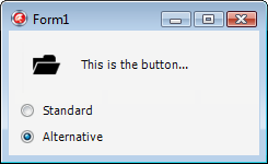
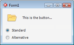
Finally, add App.Glyphs to the form’s implementation section uses clause (Alt+F11) and run the application. If all goes well, clicking on the radio boxes should toggle the button glyph:

GlyphStyleDemo - standard
GlyphStyleDemo - alternative

One thing to watch out for is that if you save everything, close and then reopen the project and have the form open in the IDE without either StdGlyphsForm or AltGlyphsForm too, the button’s styling will revert to a normal TPanel. This is nothing to worry about – close the form, open one of the glyph forms, then reopen the form, and the image will be back.

At the end of the day, I’m pretty happy with all this. While there was the odd irritating oversight in the FireMonkey source to work around, overall I find the style system here producing a more convenient approach that the VCL – in particular, it’s much nicer to be able to refer to a glyph by name rather than a meaningless numerical index. Moreover, the cosmetic issue of the custom style apparently being ‘lost’ when the main form is open without one of the glyph forms alongside is just that – cosmetic. In contrast, if the form were a VCL one with a TToolBar referencing a TImageList on a data module, the IDE would silently clear the actual reference!

Postscript – using TSubImage

As a final note, there is one variant of my approach that you might wish to consider. This is to replace the individual TImage instances with individual TSubImage ones, which then reference a single big TImage (TSubImage isn’t automatically registered, annoyingly enough, so you’ll need to do what Jeremy North did for TStyleTag here first). The reason is that when a control is used as a style, a copy of it is taken – and one aspect of the copy in a TImage case will be the contents of its Bitmap property.

If this were the VCL that wouldn’t be an issue due to the fact TBitmap there implements a reference counting system internally. In other words, when you do DestBitmap.Assign(SourceBitmap) in a VCL application, no ‘deep copy’ of the source bitmap is made, similar to how DelphiString2 := DelphiString1 doesn’t cause character data to be duplicated ‘there and then’ – rather, copying only happens when one of the two bitmaps or strings is modified later (the jargon for this is ‘copy on write semantics’). Unfortunately, the FMX TBitmap does not implement this behaviour though, and because of that, doing DestBitmap.Assign(SourceBitmap) causes an immediate ‘deep copy’ of the source, duplicating the bitmap bits in memory. For a small application with a small number of glyphs that won’t matter, and perhaps it won’t matter much either in a bigger program. As an application grows you might want to at least consider swapping out the individual TImage controls for TSubImage ones though. Thanks to the flexibility of the styling system, the task shouldn’t be too hard – all existing style associations can be kept intact.
Fixing a FireMonkey TCheckBox/TAction bug

Try this:

  • Create a new FireMonkey HD application, before adding a check box and an action list to the form.
  • Double click the action list and add an action to it; set the action’s AutoCheck property to True.
  • Assign the action just created to the check box’s Action property.
  • Double click the form to create a handler for its OnCreate event. In the handler, set the action’s DisableIfNoHandler property to False:
procedure TForm1.FormCreate(Sender: TObject);
begin
  Action1.DisableIfNoHandler := False;
end;
  • Run the application; once showing, click the check box. Expected: its checked state is toggled. Actual: nothing happens
  • In fact, toggling the check box does work, however you need to double click the control for this to work. This is patently a bug caused by the IsChecked property setter getting called twice in the course of a single mouse click

To fix the problem, you can at a pinch create a suitable interposer class. Doing that won’t be very ‘clean’ however because the IsChecked property setter isn’t virtual, so do this instead:

  • Take a copy of FMX.Controls.pas, add it to your project, and open it up.
  • Find your way to the implementation of TCheckBox.MouseUp.
  • Ignoring the reams of ‘Live’Bindings support code, add a check for IsCheckedStored in front of IsChecked being toggled:
if IsCheckedStored then IsChecked := not IsChecked;

Rebuild the application, and the bug should be fixed.

FireMonkey’s BoundsRect bug, and working around it

Just a quick one, but the BoundsRect property getter in the FireMonkey TControl is incorrectly implemented, returning (0, 0, Width, Height) rather than (Position.X, Position.Y, Position.X + Width, Position.Y + Height). At first you might be tempted to say the property just has different semantics to the VCL version, however the implementation of the property setter gives the lie to that. Steps:

  1. Create a new FireMonkey HD application.
  2. Add a button to the form.
  3. Handle the button’s OnClick event like this:
procedure TForm1.Button1Click(Sender: TObject);
begin
  Button1.BoundsRect := Button1.BoundsRect;
end;

Expected: nothing to happen. Actual: the button moves to the top-left corner of the form.

To work around this bug, either don’t read BoundsRect in the first place (it is after all just a small utility property), or put the following class helper in scope:

type
  TControlHelper = class helper for TControl
  strict private
    function GetBoundsRect: TRectF;
    procedure SetBoundsRect(const Value: TRectF);
  public
    property BoundsRect: TRectF read GetBoundsRect
      write SetBoundsRect;
  end;

//...

function TControlHelper.GetBoundsRect: TRectF;
begin
  Result.Left := Position.X;
  Result.Top := Position.Y;
  Result.Right := Result.Left + Width;
  Result.Bottom := Result.Top + Height;
end;

procedure TControlHelper.SetBoundsRect(const Value: TRectF);
begin
  SetBounds(Value.Left, Value.Top, Value.Width, Value.Height);
end;

Update 20/12/13: as pointed out in the comments, while GetBoundsRect remains as miscoded as ever in XE5, there is also a ParentedRect read-only property that does what the BoundsRect property getter should do. What a mess!

Fixing a TForm.BorderIcons bug in FMX/OS X

If you try removing biMaximize from a FireMonkey form’s BorderIcons property, you’ll find the ‘maximise’ (zoom) button on OS X (i.e., the green ‘traffic light’) resolutely staying both visible and enabled. The reason for the bug is the following code in FMX.Platform.Mac.pas, and it exists in both XE2 and XE3:

        if TBorderIcon.biMaximize in AForm.BorderIcons then
          Style := Style or NSWindowZoomButton;              

The problem here is that NSWindowZoomButton is not a valid member of a Cocoa window style ‘set’, a fact the compiler wasn’t able to pick up given Objective-C does not have strongly typed sets like Pascal. Further, you cannot in fact hide or disable the zoom button via the window style – instead, you get a reference to the actual button and hide or disable it ‘directly’.

As Apple’s UI guidelines say to disable an unwanted zoom button rather than hide it, that’s what we’ll do for our fix. So, having taken a copy of FMX.Platform.Mac.pas (or if you’ve been following this blog before, with your latest version of it open), head to TCocoaPlatform.CreateWindow. Next, comment out the lines quoted above (i.e. ‘if TBorderIcon…’). Then, immediately after the NSWin.initWithContentRect call, add the following:

    if (Style and not NSResizableWindowMask <> 0) and
      not (TBorderIcon.biMaximize in AForm.BorderIcons) then
    begin
      NSWin.standardWindowButton(NSWindowZoomButton).setEnabled(False);
      NSWin.standardWindowButton(NSWindowZoomButton).setTarget(nil);
    end;

Setting the ‘target’ to nil is necessary, otherwise the Enabled property will get automatically re-enabled – roughly, you can think of the button as having had an action assigned to it when created, and setting the Target to nil as like setting the Action property to nil again.

FMX tip: ‘labels’ with selectable text

Say you are designing a form in FireMonkey, and wish to use a read-only edit box. No problem: stick a TEdit on the form and set its ReadOnly property to False. However, doing this doesn’t give any visual indication the edit box’s contents can’t be changed. Moreover, what if you’re using a TEdit rather than a TLabel simply to allow users to copy the text, if they really want to, in which case the edit box should completely blend into the form background and not even have a border? A common example of this is the version number text shown in an application’s ‘about’ box, for example the Delphi IDE’s or Firefox’s.

In the VCL removing a TEdit’s background is no problem – set its ParentColor property to True, and its BorderStyle property to bsNone. Neither the Color, ParentColor not BorderStyle properties exist on the FMX TEdit however, since all these attributes are controlled by its style.

So, one’s first thought might be to create a custom style for the edit box. To do that, right click on the TEdit in the form designer, then choose Edit Custom Style… from the popup menu. Once the style editor is showing, head to the structure view, open up the control hierarchy, select the item labelled ‘background’, then click the little ‘delete’ button (top left). Choose ‘Apply and Close’, and both the edit box’s white background and its thin border should be gone. Great!

Custom TEdit style with default main style active

Alas, but there’s a problem – if you change the global style, the edit box’s custom style won’t be updated accordingly. E.g., here’s what happens when the ‘dark’ style is loaded:

Custom TEdit style with different main style active

The problem here is that custom styles set up at design time involve merely ‘copy and paste “inheritance”‘ from whatever style is used by the IDE at the time. Change the main style for an application later, and any custom style won’t have its underpinings updated accordingly.

While this inherent limitation of the FMX styling system is bad enough in the present scenario, it is even worse for things like customising a list box item’s style, since the default platform styles differ (as you might expect) on details like highlight colours – just try running XE3’s CustomListBox demo on OS X to see this in action. Another pain point is the XE3 platform styles relying on their own bitmaps, one per platform – since no care was taken for each control to refer to the same part of the main bitmap when running on Windows and OS X, customising a control’s style at design time can lead to half of it disappearing when the program is run on a Mac!

What we need to do, then, is not use a custom style, but correct the default style for a read-only edit box at runtime, specifically by manipulating things in a handler for the control’s OnApplyStyleLookup event. Learning what to modify exactly means delving into the source and the stock style files, preferably more than one in the case of the latter. To take the TEdit case, for example, while all the standard styles define its background by a control with a style element name of ‘background’, the control type depends upon the style. In the case of the ‘platform’ styles it is a TSubImage, which references part of one big platform-specific bitmap. In the case of the additional, vector-only styles however (like ‘dark’), a TRectangle is used. Given that, removing the background must be done in a way that is neutral between both primitive control types (i.e., TSubImage and TRectange). In fact, it’s a good idea to make the code as generic as possible, since it’s perfectly possible Embarcadero will change the internals once more in XE4 or whatever.

Anyhow, to cut to the chase, this is what I’ve come up with –

procedure TForm2.LabelEditApplyStyleLookup(Sender: TObject);
var
  Obj: TFmxObject;
begin
  Obj := (Sender as TCustomEdit).FindStyleResource('background');
  if Obj is TControl then TControl(Obj).Opacity := 0;
end;

Why make the background control transparent rather than just delete it? Ultimately, because I’m not keen on just randomly deleting internal objects. Further, talk of automatic reference counting (ARC) being introduced (see here) makes me nervous simple Free calls on FMX objects (*) will even be possible in the future given the inherent conflict between reference counting and the TComponent ownership pattern that FMX currently employs.

(*) And no, I’m not predicting ARC will be forced (or even introduced at all) for Win32/Win64 projects. I’m purely talking about FMX, on mobile and possibly desktop too given much of the framework will presumably cross compile between mobile and desktop platforms.

FMX tip: buttons with images that still have nicely-aligned captions

Unlike its VCL equivalent, the FireMonkey TSpeedButton has no Glyph property; similarly, TButton doesn’t have the image properties added to the VCL version in D2009, and in FMX, there’s no TBitBtn class to boot. The reason for this is that in principle, there is no need for class-specific image properties:

  1. Add a TImage to the design surface.
  2. Using the structure view (top left of the IDE), reparent the image to the desired button by dragging and dropping with the mouse. (It doesn’t matter whether the button is a TButton, which takes the keyboard focus, or a TSpeedButton which doesn’t.)
  3. Select the image and use the object inspector to set its HitTest property to False. This prevents it from receiving mouse clicks.

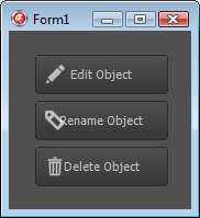
This approach works fine if the button doesn’t have a caption, but when it does, an issue arises concerning alignment: the text will remain centred in the button regardless of whether the image is aligned to a certain side, so that if the image is relatively large, text will appear partly on it, and partly on the normal background:

Poorly aligned button captions

If the button images are either left-aligned (as in this example) or right-aligned, you could manually fix up the alignment by prepending or appending spaces to the button’s Text property as appropriate, however this won’t work for top- or bottom-aligned images, and moreover, causes hassles if the button’s text comes from an assigned action. So, what would make for a more principled fix?

Well, internally, a button’s text is part of its style, which like the style for any other control is composed of more primitive FMX controls. The text, then, comes from a TText control, which is placed inside a layout control of some sort that also contains a TSubImage or TRectangle that defines the button background and border.

Given that, one way to fix the text alignment issue might be to reparent our TImage to the parent of the TText at runtime. If that sounds a bit hacky, that’s because it is, and worse, the changes made to control style handling in XE3 blogged about by Eugene Kryukov (EMBT) here make it precarious to boot. Happily however, there’s a better way: when the button’s style is loaded (or reloaded), adjust the internal TText’s Padding property so that it no longer overlaps the image.

To do this generically for a number of buttons on a form, select them all in the designer (they can be a mixture of TButton and TSpeedButton controls if you want), click to the Events tab of the Object Inspector, type ButtonApplyStyleLookup next to OnApplyStyleLookup, and press Enter. This will create a shared event handler for the buttons’ OnApplyStyleLookup event. In the code editor, add the following for its implementation:

procedure TForm1.ButtonApplyStyleLookup(Sender: TObject);
var
  Button: TCustomButton;
  Control: TControl;
  TextObj: TFmxObject;
begin
  Button := (Sender as TCustomButton);
  for Control in Button.Controls do
    if Control is TImage then
    begin
      TextObj := Button.FindStyleResource('text');
      if TextObj is TText then
        case Control.Align of
          TAlignLayout.alLeft:
            TText(TextObj).Padding.Left := Control.Width;
          TAlignLayout.alTop:
            TText(TextObj).Padding.Top := Control.Height;
          TAlignLayout.alRight:
            TText(TextObj).Padding.Right := Control.Width;
          TAlignLayout.alBottom:
            TText(TextObj).Padding.Bottom := Control.Height;
        end;
      Break;
    end;
end;

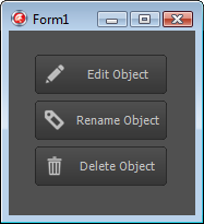
What we do here is cycle through the button’s controls looking for the TImage; when we find it, we then look for the TText style resource and adjust its Padding accordingly. Here’s the result:

Nicely aligned button captions

PS – if having read this far you’d still prefer a button class with a dedicated Bitmap property, check out Mike Sutton’s custom TSpeedButton descendant here.